Wikipedia:Extended image syntax
| This page documents an English Wikipedia editing guideline. Editors should generally follow it, though exceptions may apply. Substantive edits to this page should reflect consensus. When in doubt, discuss first on this guideline's talk page. |
This editing guideline documents the syntax used to insert pictures and other media files into Wikipedia pages. The same syntax is used regardless of whether a file is from Wikipedia or Wikimedia Commons. New editors are encouraged to also see the picture tutorial and the simple guide for beginners.
Brief syntax
In brief, the syntax for displaying an image is:
[[File:Name|Type.|Border |Location |Alignment |Size |link=Link |alt=Alt |page=Page |lang=Langtag |Caption]]
Plain type means you always type exactly what you see. Bold italics represent a variable, which you replace with its actual value.
Of the parameters shown, only Name is essential. Most images should use [[File:Name|thumb|alt=Alt|Caption]] and not specify a size.
The other details:
- are optional and
- can be placed in any order, except for Caption that has to be the last parameter.
- Type
thumb(orthumbnail; either can be followed by=filename),frame(orframed), orframeless. Displays the image with specific formatting (see below).- Border
border. Put a small border around the image.- Location
right,left,centerornone. Determine the horizontal placement of the image on the page. This defaults torightfor thumbnails and framed images.- Alignment
baseline,middle,sub,super,text-top,text-bottom,top, orbottom. Vertically align the image with respect to adjacent text. This defaults tomiddle.- Size
uprightorupright=scaling factor. Scale a thumbnail from its default size by the given factor (default 0.75), rounding the result to the nearest multiple of 10 pixels. Theuprightoption must be used along with thethumborframelessparameter. Alternatively, and only where absolutely necessary, users' preferences may be disregarded and the size of the image fixed by specifying a size in pixels:Width pxorx Height pxorWidth x Height px. Scale the image to be no greater than the given width or height, keeping its aspect ratio. Scaling up (i.e. stretching the image to a greater size) is disabled when the image is framed.- Link
- Link the image to a different resource, or to nothing.
- Alt
- Specify the alt text for the image. This is intended for visually impaired readers. See WP:ALT for how this should typically differ from the caption.
- Page
- Specify a page other than 1 to use for the thumbnail image in multipaged files.
- Langtag
- Specify the IETF language tag (slang: langtag) for
switch-translated SVG (Scalable Vector Graphics) files. Some SVG files are multilingual; this parameter specifies which language to use. The langtag should be all lowercase (e.g.,zh-hansrather thanzh-Hans). Defaults to current Wikipedia language in article namespace orenin other namespaces. See{{Translate}}. - Caption
- Not a keyword, the actual caption text. Must be last option. This is visible if the
thumborframeattribute is used, but may be displayed on mouseover in other cases.
Detailed syntax
The image syntax begins with [[, contains components separated by |, and ends with ]]. The [[ and the first | (or, if there is no |, the terminating ]]) must be on the same line; other spaces and line breaks <br> (or <br />) are ignored if they are next to | characters or just inside the brackets. Spaces or line breaks are not allowed just before the = in the following options, and may have undesirable side effects if they appear just after the =.
Do not terminate with the code |]]; this will be taken as an empty caption and override any real caption before it.
Type
One of these options may be specified to control whether or not the image is scaled and/or given a border. For options that automatically scale the image, it's usually to 220px; logged-in users can modify this (at "Thumbnail size" under Preferences → Appearance → Files). This is important to users with (e.g.) limited vision. If this is too large or small the upright attribute can be used. Specifying a fixed size in pixels overrides all of this, but is unfriendly to users who need a larger image.
thumb(orthumbnail)- Automatically scale the image, and put a box around it. Show a caption if specified. Float the image on the right unless overridden with the location attribute. With an operand, e.g.
thumb=Example.png, the operand names an image that is used as the thumbnail, ignoring any size specification. frame- Preserve the original image size, and put a box around the image. Show any caption below the image. Float the image on the right unless overridden with the location attribute. Note: Any size options specified will be ignored and flagged as a 'bogus file option' by the Linter.
frameless- Automatically scale the image up or down. Place it inline with the text unless overridden with the location attribute.
- Nothing specified
- Preserve the original image size, and do not add a border around the image. Place it inline with the text unless overridden with the location attribute. Do not show a caption. If no alt text is specifically requested, use the requested caption as alt text. This option is almost exclusively used in templates.
Border
border- Generate a one-pixel border around the image. This has an effect only around unframed images (those without
|thumband|frame), as framed images always have borders.
Location
One of these options may be specified to control the position of the image. For examples of how all this works, see Examples of location parameter.
right- Place the image on the right side of the page. The article text that follows the image flows around the image. This is the default when
thumborframeis used. left- Place the image on the left side of the page. The article text that follows the image flows around the image, but there may be formatting issues with lists and indented text (see § Interaction between left-floating images and lists).
center- Place the image in the center of the page. The article text that follows the image is placed below the image.
none- Place the image on the left side of the page. The article text that follows the image is placed below the image.
- Nothing specified, and neither
thumbnorframe - The image is placed inline with the text,
 like this.
Vertical alignment
One of these options may optionally be specified to control the vertical alignment of the image with respect to adjacent text.
These vertical alignment options apply only to plain images, which do not cause breaks and are not floated (that is, they do not work with images that need text to flow around them. To make text flow around an image, place the image preceding the text and use the thumb parameter).
In the following list, each option's explanation is preceded by what File:Flag of Hungary vertical.svg looks like when aligned using the listed option, using the markup
of [[File:Flag of Hungary vertical.svg|option|frameless|upright=0.1|link=|alt=]]
middle:
![]() (This is the default.) Align the vertical middle of the image with the baseline of the text plus half the x-height of the text, so that the image is vertically centered around a lower case "x" in the text.
(This is the default.) Align the vertical middle of the image with the baseline of the text plus half the x-height of the text, so that the image is vertically centered around a lower case "x" in the text.
baseline:
![]() Align the bottom of the image with the baseline of the text.
Align the bottom of the image with the baseline of the text.
sub:
![]() Align the bottom of the image to the same level that the bottom of a subscript would be, such as the bottom of the "2" in "X2".
Align the bottom of the image to the same level that the bottom of a subscript would be, such as the bottom of the "2" in "X2".
super:
![]() Align the bottom of the image to the same level that the bottom of a superscript would be, such as the bottom of the "2" in "X2".
Align the bottom of the image to the same level that the bottom of a superscript would be, such as the bottom of the "2" in "X2".
text-top:
![]() Align the top of the image to the top of the text. This is often a bit higher than the top of a capital letter, because of ascenders in letters like lower-case "h".
Align the top of the image to the top of the text. This is often a bit higher than the top of a capital letter, because of ascenders in letters like lower-case "h".
text-bottom:
![]() Align the bottom of the image to the bottom of the text. This is somewhat lower than the baseline, because of descenders in letters like lower-case "y".
Align the bottom of the image to the bottom of the text. This is somewhat lower than the baseline, because of descenders in letters like lower-case "y".
top:
![]() Align the top of the image to the top of the line containing the text. Normally this is slightly higher than the top of the text, to make space between lines of text.
Align the top of the image to the top of the line containing the text. Normally this is slightly higher than the top of the text, to make space between lines of text.
bottom:
![]() Align the bottom of the image to the bottom of the line containing the text. Normally this is slightly lower than the bottom of the text.
Align the bottom of the image to the bottom of the line containing the text. Normally this is slightly lower than the bottom of the text.
Size
Any or none of these options may be specified to control the size of the image. In the case of images with captions, if the image is already smaller than the requested size, then the image retains its original size (it is not enlarged). In the case of images without captions, the image will be enlarged or reduced to match the requested size. Sizing is disabled when the type 'frame' is use, with the size options being flagged as a bogus file option at Special:LintErrors.
The default thumbnail width can be set in the preferences, so specifying in px is not recommended in order to respect the users' preferences, which may be important for accessibility. Exceptions can, of course, be made, but do try to use upright or the default if possible.
Implementation details
|
|---|
|
Specifying a size does not just change the apparent image size using HTML; it actually generates a resized version of the image on the fly and links to it appropriately. This happens whether or not you specify the size in conjunction with "thumb".
This means the server does all the work of changing the image size, not the web browser of the user. Having the server do all the work means faster downloading of pages. It also means that larger images can be stored on the server without any slowdown by the browser (especially on dial up telephone lines). Only the data for the actual size on the page is transmitted. An exception is animated GIF images. Animated GIF images are not processed by the server. When a smaller size is specified the original full sized animated GIF image is served. Whether the animated GIF image is subsequently scaled to fit the allotted space belongs to the capabilities of the receiving browser. Resizing an animated GIF image will significantly reduce its quality, without any reduction of download time. When there are two or more "size" options of the same type, only the last one is valid. However, if both an upright and an absolute size are used together, the absolute size always takes precedence, regardless of where it appears in the options. |
- (nothing specified)
- For thumbnails, use the size specified in preferences for logged in users, and use a size determined by resolution for users who are not logged in. For non-thumbnails, use the native size of the image.
uprightorupright=scaling factor- Scale a thumbnail's size to scaling factor times the default thumbnail size, rounding the result to the nearest multiple of 10. For instance,
upright=1.5makes the image larger, which is useful for maps or schematics that need to be larger to be readable. The parameterupright=1returns the same size as thumbnail width, andupright=0.75is functionally identical touprightalone. If you set scaling factor equal to the image's aspect ratio (width divided by height) the result is equivalent to scaling the height to be equal to the normal thumbnail width. - The
uprightoption only works with thethumborframelessparameter (see Type). - Width
px - (E.g.
100px) Scale the image to make it the specified number of pixels in width, and scale the height to retain the original aspect ratio. xHeightpx- (E.g.,
x150px) Scale the image to make it the specified number of pixels in height, and scale the width to retain the original aspect ratio. - Width
xHeightpx - (E.g.
100x150px) Scale the image to be no wider and no higher than the specified number of pixels. The image will keep its original aspect ratio.
Link
|link=Page- Ordinarily, clicking on an image takes the reader to the image description page. The link option allows the reader to be taken instead to a different page, such as a fuller image from which the thumbnail was cropped, or to a full document of which the thumbnail was a single page (or crop of a single page). Do not enclose the page name in square brackets. If Page is a URL, the reader will be taken outside the project; this is not normally done in article space.
|link=(alone)- Disables the link so that clicking on the image does nothing.
|link= affects only what happens when the image itself is clicked; |thumb images carry a little rectangle-rectangle icon ![]() in the caption area, and clicking that always leads to the image description page. Except for public-domain images, it must always be possible for the reader to reach the image-description page, so
in the caption area, and clicking that always leads to the image description page. Except for public-domain images, it must always be possible for the reader to reach the image-description page, so |link= should be used only with |thumb images.
|link= cannot be used with |frame.
To disable all linking from, and description of, a purely decorative image – so that it's ignored by screen readers – use "|link=|alt=" with no arguments for either parameter.
Alt text and caption
Zero or more of these options may be specified to control the alt text, link title, and caption for the image. Captions may contain embedded wiki markup, such as links or formatting. See Wikipedia:Captions for discussion of appropriate caption text. See Wikipedia:Alternative text for images for discussion of appropriate alt text. Internet Explorer displays the link title as a tooltip but other browsers may not.[needs update]
Hint: to force the caption to be written (underneath the picture) and not just appear as "hover text" even when you wish to resize the image, specify "thumb". If you specify "frame" the caption does appear but any resizing (such as "125px") is ignored.
alt=Alt- Use Alt as the alt text for the image.
- Caption
- (the last option that is not recognised as some other part of the image syntax): How this text is used depends on the image type. When the type has a visible caption ("
thumbnail", "thumb", "frame" or "framed") then this text appears as a caption below the image. Otherwise, (if the image type is unspecified or is "frameless"), this text is used for the link title provided the link has not been suppressed with "|link=", and also for the alt text provided an explicitalt=Alt has not been supplied.
The actual alt text for the displayed image will be one of the following, in order of preference:
- The explicitly requested Alt, if any;
- The explicitly requested Caption, if the image type has no visible caption;
- The empty string, if there is an explicitly requested Caption and the image type has a visible caption.
- The image file name if there is no explicitly requested Alt or Caption. This is never a satisfactory option.
It is possible to specify the link title text only for images with no visible caption (as described above). However, as not all browsers display this text, and it is ignored by screen readers, there is little point.
Note: alt is supported only for images. Audio and video files should use timed text.
Class
class=- Used to insert any HTML classes for image. This has an effect only for classes listed specifically in Wikipedia:Catalogue of CSS classes, or some classes produced by TemplateStyles.
- The special class
class=notpageimagewill exclude the image from being selected by the Page Images algorithm.(phab:T301588) class=skin-invertwill cause the image's colors to be inverted in dark mode.class=skin-invert-imagewill only invert the image and not the caption.
Page
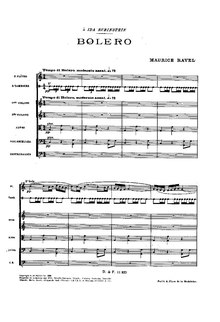
Normally page 1 from a PDF or DjVu file is used to generate the thumbnail. A different page can be used with the parameter |page=: [[File:IMSLP01578-Ravel - Bolero Full Score Durand 1929.pdf|thumb|page=2|''Boléro'': page 2 from the score]]:
Examples
Using the basic syntax
The most basic example uses the syntax [[File:Westminstpalace.jpg|Alt text]]. This does not scale the image or allow text to wrap around it. This is not normally appropriate in an article.
This is rendered inline, and the specified text is used as the image's alt attribute (alternate text for programs which cannot display images, such as screen readers) and as the title attribute (supplementary text, often displayed as a tooltip when the mouse is over the image). See Wikipedia:Captions for discussion of appropriate caption text. See Wikipedia:Alternative text for images for discussion of appropriate alt text.
Above, the image of the Thames was put into its own paragraph. This isn't mandatory; images can sit inline in text, as shown below.
text text text text text text
[[File:Westminstpalace.jpg|150px|alt=A large clock tower and other buildings line a great river.|The Palace of Westminster]]
text text text text text
[[File:tst.png|100px|alt=Tiny globe|This is a globe.]]
text text text text
gives
text text text text text text
 text text text text text
 text text text text
Keeping the original size, with a caption
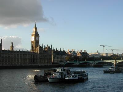
To display an image as uploaded with a caption use [[File:Westminstpalace.jpg|frame|none|alt=Alt text|Caption text]].
Aligning thumbnails to fit into text

This is the style most familiar to readers. As shown on in the example image, the image is framed, is an appropriate size, and has text able to wrap around it. A caption is properly integrated.
The important part of this is the thumb parameter: [[File:Westminstpalace.jpg|thumb|upright=0.4|left|alt=A large clock tower and other buildings line a great river.|The Palace of Westminster]] (as shown in the left). For details of these options, see previous sections.
Examples of the location parameter are below:

[[File:Westminstpalace.jpg|thumb|alt=A large clock tower and other buildings line a great river.|right|upright=0.35]] (shown on the right).
[[File:Westminstpalace.jpg|thumb|alt=A large clock tower and other buildings line a great river.|left|upright=0.35]] (shown on the left).The many-floating-objects problem
There is a floating issue in HTML/CSS that prevents certain images (or other floating objects) from floating above others. It occurs only if:
- there are multiple floating objects on one side of the page
- the floating object on the other side of the page comes after the other ones in the source code
The first floating object on the latter side of the page won't float above the last floating object on the former (see examples below). Solutions include alternating between left and right in aligning images or other floating objects (not shown); setting to "none" the alignment of the one that won't float above the others (as demonstrated on the population table here); and using a gallery tag for large numbers of images in a single section. Per MOS:ACCESS#FLOAT, images should be inserted in the relevant section (i.e. do not place the markup above the section headline), even if that can cause them to float into the next section.
Problematic code:
==Section 1==
[[File:Westminstpalace.jpg|thumb|70px|right|Figure 1.1 ('''right''')]]
[[File:Westminstpalace.jpg|thumb|70px|right|Figure 1.2 ('''right''')]]
[[File:Westminstpalace.jpg|thumb|70px|right|Figure 1.3 ('''right''')]]
[[File:Westminstpalace.jpg|thumb|70px|right|Figure 1.4 ('''right''')]]
Lorem ipsum dolor sit amet, consectetur adipiscing elit, sed do eiusmod tempor incididunt ut labore et dolore magna aliqua.
==Section 2==
[[File:Westminstpalace.jpg|thumb|70px|left|Figure 2.1 ('''left''')]]
Lorem ipsum dolor sit amet, consectetur adipiscing elit, sed do eiusmod tempor incididunt ut labore et dolore magna aliqua.


Lorem ipsum dolor sit amet, consectetur adipiscing elit, sed do eiusmod tempor incididunt ut labore et dolore magna aliqua.


Lorem ipsum dolor sit amet, consectetur adipiscing elit, sed do eiusmod tempor incididunt ut labore et dolore magna aliqua.

-
Figure 1.1
-
Figure 1.2
-
Figure 1.3
-
Figure 1.4
For more information on the gallery tag, see Help:Gallery tag.

Using "upright"

upright" option is about 75% of thumbnail width.
upright=1.5" option The upright option works in combination with the thumbnail or thumb option to resize an image to about 75% of the width of a plain thumbnail. This is useful for displaying images in "portrait" orientation, since such tall and narrow images tend to look too large when scaled to the same width as "landscape" oriented images. The upright option scales larger or smaller in step with user screen resolution. The relative size can be determined with a multiplier such as upright=x. If x=1 then the image is standard thumbnail width. E.g., [[File:Westminstpalace.jpg|thumbnail|upright|left|alt=A large clock tower and other buildings line a great river.|The "<code>upright</code>" option is about 75% of thumbnail width.]] (shown on the left) and [[File:Westminstpalace.jpg|thumb|upright=1.5|right|alt=A large clock tower and other buildings line a great river.|The "<code>upright=1.5</code>" option]] (shown on the right).
Using frame

With this option, the embedded image is shown with its actual size enclosed by a frame, regardless of the "thumb" or "size" attribute, and the caption, if any, is visible in the frame. Without the options left, center, and none, the image is normally on the right: [[File:Westminstpalace.jpg|frame|alt=A large clock tower and other buildings line a great river.|The Palace of Westminster]].
With none of the options other than sizepx and alternate (caption) text, an embedded image is rendered inline.
Using alignment "none" thumbnails in tables
The option none can be used to have thumbnails without left- or right-alignment. This is probably most useful for tables. This is an example:
Formatting and links in captions

You can put links in the caption text, as demonstrated in this image:
[[File:Westminstpalace.jpg|right|thumbnail|alt=A large clock tower and other buildings line a great river.|This is the [[Palace of Westminster]] in London]]
Just make sure the number of opening and closing square brackets are right. One extra or missing would mean the entire image syntax line would not work.

Additional caption formatting options are possible; all normal formatting should just work.
[[File:Westminstpalace.jpg|right|thumbnail|alt=A large clock tower and other buildings line a great river.|<div style="text-align: center">This is <span style="color: green">the </span><br /> [[Palace of Westminster]]<br /> '''in <span style="color: red">London</span>'''</div>]]
Interaction between left-floating images and lists
List bullets and numbers can sometimes overlap left-floating images, and indented lines may not appear correctly when next to left-floating images. For example:
| Markup | Renders as |
|---|---|
|
|
|
|
The {{flowlist}} template enables lists to stay clear of these left-floating objects:
[[File:Westminstpalace.jpg|left|thumb|100px]]
{{flowlist}}
  <ol>
    <li>list item A1
      <ol>
        <li>list item B1</li>
        <li>list item B2</li>
      </ol>continuing list item A1
    </li>
    <li>list item A2</li>
  </ol>
{{endflowlist}}

{{flowlist}}
First line
:Second line
::Third line
:::Fourth line
{{endflowlist}}
Renders as:

- list item A1
- list item B1
- list item B2
- list item A2

First line
- Second line
- Third line
- Fourth line
- Third line
This method will not work inside of a table, and if your list is longer than the floated element, then the list will not flow around the image like normal, but instead be one block, leaving white space below the floated element.
Overlaying annotations on an image
| Parts of this Wikipedia page (those related to how this works with Imagemap templates?) need to be updated. Please help update this Wikipedia page to reflect recent events or newly available information. Relevant discussion may be found on the talk page. |
In some cases, it may be desirable to add clickable annotations to an image. The templates Template:Annotated image and Template:Annotated image 4 exist for this purpose.
These templates allow wikitext (e.g., regular text, wikilinks, allowed HTML code, references, and other templates) to be included on the image itself. They may also be used to crop an image so as to focus on a particular portion of it, or alternatively, expand the white area around an image for better placement of wikitext.
|
|
 |
There is also the template {{Overlay}}:
| ||||||||||||||||
Only item 7 is linked here.
Superimposing images
Images can be overlaid or superimposed using {{Superimpose}}, {{Superimpose2}} or {{Overlaid images}}.
Cropping images
Images can be cropped using {{CSS image crop}} or {{Annotated image}}.
Cancelling floating-around-image mode
After having had an image floating next to text, putting further text below it (and again using the full width) can be done with the following markup. This blocks an image from appearing next to the material following this markup. The reason for this could be aesthetic or a change in topics.
This can be issued by using template {{clear}} or {{Clr}} or {{-}} in certain namespaces (en, meta).
VR images
To display VR photographs (aka 360-degree panoramas or photospheres), use {{PanoViewer}}.
Linking to the image without displaying it
If you don't want to show or display the image but rather just want to make a link to the description page for an image, use a leading colon before "File:" in an intra-wiki link, like this: [[:File:STS-32 crew.jpg|STS-32 crew]] which yields: STS-32 crew.
Sound files
Often, sound files are presented on Wikipedia pages using {{Listen}} or its related templates. However, it is also possible to present an audio file without using any template. Similar syntax to images can be used to transclude audio or video files into pages.
| Code | Output | |
|---|---|---|
| 1. | [[File:Accordion chords-01.ogg]]
|
|
| 2. | [[File:Accordion chords-01.ogg|frameless|upright=1.3]]
|
Note that none of these examples provide links to Wikipedia:Media help, and example 2 provides no navigable links to the file itself. Consequently, whenever this method is used, the {{Inline audio}} template must be shown on that page, and the presentation of the play buttons must be accompanied by clickable links to the sound file itself. Examples:
| Code | Output | |
|---|---|---|
| 1. | [[File:Accordion chords-01.ogg|frameless|upright=0.4|left]] [[:File:Accordion chords-01.ogg|Accordion chords]]
|
|
| 2. | [[:File:Accordion chords-01.ogg|Accordion chords]] [[File:Accordion chords-01.ogg|90px|right]]
|
Accordion chords |
| 3. | [[:File:Accordion chords-01.ogg|Accordion chords]] [[File:Accordion chords-01.ogg|90px]]
|
Accordion chords |
Note that vertical alignment of the play button does not work, nor is it possible to present the play button inline with text; consequently, the most pleasing arrangement is achieved with examples 1 or 3.
There is also a parameter to preset the player to start at a time other than 0:00.
| Code | Output | |
|---|---|---|
| 1. | [[File:Accordion chords-01.ogg|start=0:05]]
|
MIDI
Since June 2019, MIDI files can be played just like other sound files. See: Help:Score.
[[File:Beethoven Op. 33 no. 1.mid|thumb|[[Bagatelles, Op. 33 (Beethoven)|''Bagatelles'', Op. 33]], no. 1]]
Video files
To display a video as uploaded with a caption use [[File:First flights in aviation history.ogg|frame|none|Caption text]].
Initial still image
"|thumbtime=Time". Use the frame from the video at the given time as the initial still image. Time is either a number of seconds, or hours, minutes and seconds separated by colons. Without a thumbtime parameter, a frame from the midpoint of the video is used by default. For instance, using the same video file as previously:
Temporal media fragments
This syntax allows you to play a segment of the video stream or set a start time. Hover over the player to see start time listed as 5s, press play and notice it stops playback at 7 seconds.
[[File:Weeding.ogv|thumb|upright=1.3|start=5|end=7|Starts at 5 seconds and ends playback at 7 seconds]]
Note: This is not yet supported by Safari and Internet Explorer.
Displaying small videos larger
To display a video larger than its uploaded size use "|thumb" and "|numberpx". This may be useful if the original video is very small but shows some important but small detail, but note that upscaling may create unexpected scaling artifacts. For example, the code
[[File:cal16x16check_vdnocnoafr1len2.avi.q10.ogv|inline|left]] [[File:cal16x16check_vdnocnoafr1len2.avi.q10.ogv|right|thumb|128px]]
- displays the 16 pixels wide video at its original size on the left and eight times wider at the right (the squares should be all black or all white and the edges should be sharp — any blurriness or off-white colour is likely due to the browser or the Wikimedia server rendering):
Thumbtime in a gallery
The thumbtime parameter can also be used inside a gallery (either with <gallery> tags or the {{Gallery}} template):
-
Man in suit tie and hat at 21 seconds.
-
Monoplane seen at 23 seconds.
Here is the wikicode that created it:
<gallery>
File:First flights in aviation history.ogg|thumbtime=21|Man in suit tie and hat at 21 seconds.
File:First flights in aviation history.ogg|thumbtime=0:23|Monoplane seen at 23 seconds.
</gallery>
See also
- Wikipedia:Images – For an overview of images in Wikipedia
- Help:Pictures
- Wikipedia:Picture tutorial
- Wikimedia Commons (Commons Main Page), a free multimedia repository, that you can use directly in Wikipedia and the other Wikimedia projects. You can upload new images or use the stored ones.
- Commons:Commons:Video – Outline of videos on Commons; using, playing, policy, finding, converting and uploading
- Wikipedia:Creation and usage of media files – A how-to guide, old but still useful
- Wikipedia:Image use policy
- Wikipedia:Image markup with HTML – How to add images to articles, old school. Obsolete but interesting.
- Wikipedia:Finding images tutorial
- meta:Help:Images and other uploaded files
- mw:Extension:PagedTiffHandler –
lossyparameter for tiff files


